Poster Presentation Guidelines
All posters will be displayed on both days. Poster sessions are at the following times:
Wednesday, November 6, 2024
Thursday, November 7, 2024
3:15 PM – 4:45 PM (Both Days)
You should be at your poster to present your work during both poster sessions. Poster set-up begins at 8:00 AM on Wednesday, November 6 and all posters need to be removed by 5:00 PM on Thursday, November 7.

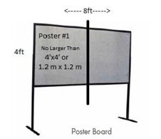
Your poster should be no larger than 48 inches x 48 inches (4 feet x 4 feet or 1.2 m x 1.2 m), but ideally should be slightly smaller, such as 46 inches x 46 inches so that there is some space between your poster and the other presenter’s poster (see image). Each poster board will have 4 posters affixed to them, two on one side and two on the other side.
ASPE will provide thumbtacks.
Do not send your poster ahead-of-time; simply bring it with you to the 39th ASPE Annual Meeting. Poster boards will have the subject area and title of your paper to help you to determine where you should place your poster on your assigned day.
Helpful Guidelines when Preparing your Poster
- Highlight the precision engineering principles that are applicable to your work. This is critically important in building a thread throughout all of the conference presentations.
- Make your poster title so that it quickly attracts your audience. Make the title the most prominent block of text on the poster.
- The poster should quickly have your audience understanding the subject and purpose. This is often accomplished with a meaningful title, a clearly-stated objective and supporting images. The font size should be large enough to read from a distance of 6 feet, and the color of the text should contrast with the color of the background. Important information should be readable from about 10 feet away.
- Your findings should be obvious and easy for the reader to locate. Highlight important data in your graph or table. Individual sections should be designed so that the reader can quickly read them – large blocks of texts don’t lend themselves to easy comprehension in the busy poster presentation environment. The use of bullets, numbering, and headlines make posters easier to read. If possible, you should rely on mostly images to tell the story of your research.
- Finally, please prepare and practice the delivery of your presentation. The poster is not meant to stand alone but should serve as the support for a spoken presentation. It helps to prepare a short “elevator pitch” style presentation that highlights your findings in just a few minutes, and then have more details for an engaged audience. The most in-depth conversations, idea transfer and generation, and networking often occur during the face-to-face poster presentations.

